The Tree Farm
Category
WebsiteCustomer
Tree Farm RFV, LLCDate
2020Role
Solo FreelancerWeb Design
Web Development
As they battled for permits in town halls and public hearings, Tree Farm RFV was having a hard time conveying the message about the benefits of a new community. Small town locals and businesses were having a hard time seeing the vision from scathing newspaper articles.
I was commissioned to redesign their website and improve their SEO, as one piece of the puzzle to change public opinion and garnish interest in everything The Tree Farm has to offer.
- User Research
- UX Design
- UI Design
- Web Development & SEO
- Website Testing
- Ongoing Maintenance
Project Overview
Problems
- Existing website didn't meet marketing strategy
- Public perception of the project was negative
- Information about the project was hard to find
Solutions
- Research what people's main issues were with the project
- Design a website to enlighten the public
- Make it easier to find information about the project
Outcomes
- Front page on Google, beating SEO for negative newspaper articles
- 100+ new organic visitors per month, proving that the website was reaching the public
Empathize
When confronted with the project, my first step was to empathize with the client and the users. The client and I jumped on a video call so I could gauge their opinion about their existing product. They started pointing out all the areas of the website that were out of date, and hinted several times that the website didn't look "modern" but couldn't explain why. The sitemap of the website seemed to already fit with their vision but the styling didn't fit the new brand.
- Why was their existing website not wokring for the marketing strategy?
- What made the styling appear "not modern" in their eyes?
- What parts did they like about the existing website?
As they explained the premise of the real estate development they were doing and all the various phases it involved, the results started to take shape and I was able to reliably visualize their perspective. I could see that the website didn't meet the client's expectations for the current marketing phase they were about to enter into. Users testified to having a hard time finding the site if they didn't already know very specific details about the project. Information was buried and not readily available to users. Photos on the site portrayed old architectural renderings which would cause confusion and false advertising to the users. Tree Farm RFV had also rebranded recently so the logos, contractors and project size were all generating misinformation.
The client was about to embark on a heavy marketing campaign and their old website needed to reflect the current state of the project to provide updates and draw in new customers.
Proto-Personas


Define
The requirements of the website redesign focus heavily on the problems observed in the Empathy phase. I drew up some drafts to review with the client and we settled on the following objectives.
Proto-Persona Problem Statements
-
As a restaurateur, I am seeing conflicting information about the Tree Farm development between the newspaper, town halls, and their website. I want to know what's going on so that I can determine if this development will provide a good spot to open my business or if I should look elsewhere.
-
As a teacher and potential buyer, I am looking for an affordable place to live but am struggling to find something. I've heard about the Tree Farm offering affordable housing but it isn't even built yet. Will these apartments be completed by the time I need to move?
-
As a local resident, I can't find anything about the amenities that the Tree Farm offers. I want to know how/if I can get involved in the construction process and what that space will look like after it's done.
Requirements
- Must be adequately displayed on major browsers (Chrome, Firefox, Edge, Safari)
- Must be adequately displayed on screen sizes of common devices (phone, desktop, tablet)
- Must follow SEO best practices
- Must contain a carousel as the main visual focus of the landing page
- Must contain an interactive map with the location of the property clearly visible
- Must contain a "Play" section, describing the recreational activities and amenities of the property
- Must contain a "Live" section, describing the residential opportunities of the property
- Must contain a "Stay" section, describing the vacationing opportunities of the property
- Must contain a contact form, for users to submit custom messages to Dave Marrs' email address so he can handle inquiries
- Must have the ability to download various documents from the server
Ideate

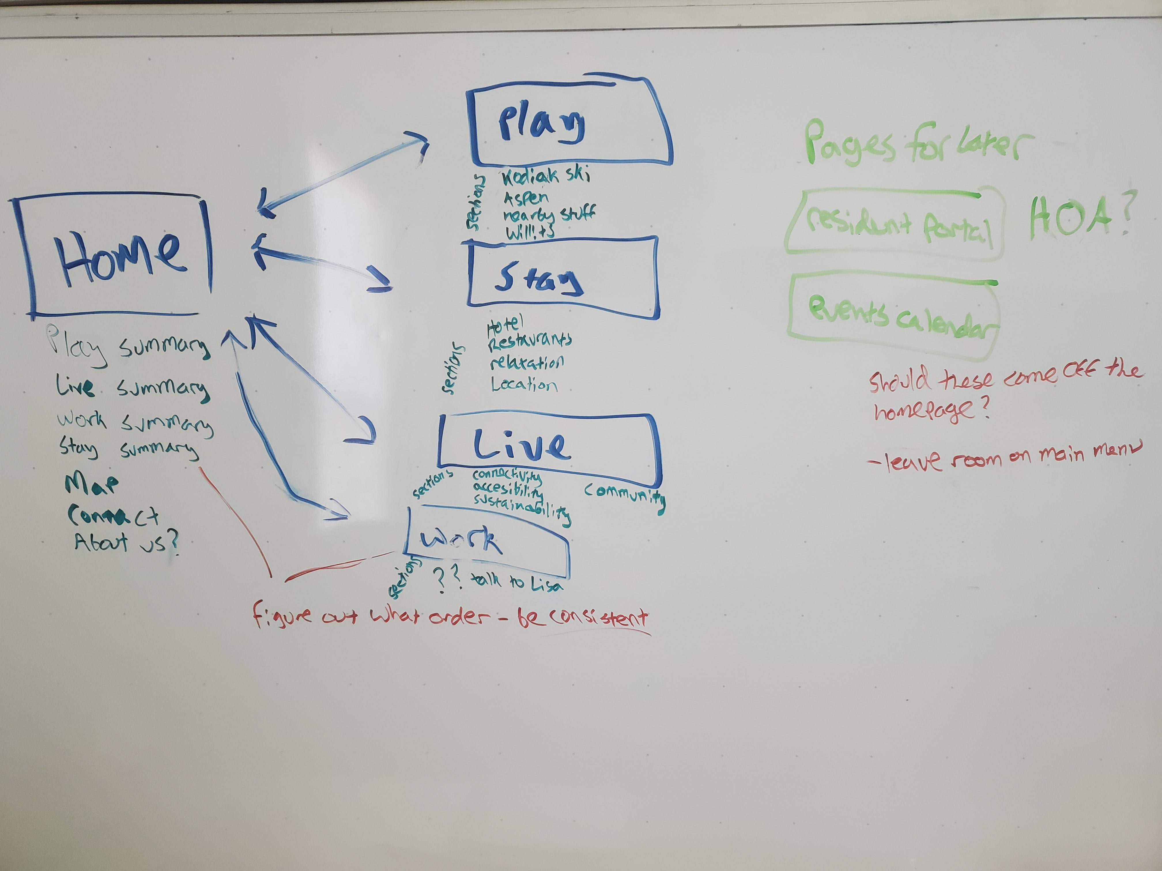
At this point I sketched up some low fidelity mockups, planned out a sitemap and was salvaging as much of the content as the existing website as possible. There were some major decisions to make during this stage.
Side note: While pen and paper is usually faster, I was working 100% remote with this client. I used Balsamiq mockups to generate the low fidelity mockups to ease the communication process with the team.
Single-Page vs. Multi-Page
The sitemap was simple and the anticipated textual content was minimal so this website seemed primed for a single-page direction. However, by the end of this phase the tables had flipped. The client hired on a copywriter/copyeditor as well as a photographer. Plans were revised to have short summary paragraphs on the home screen but we needed dedicated pages to hold all the details for each section. Also, the client had aspirations to expand the website's usage to include customer portals once businesses and residents were established in the new buildings.
Color Scheme
This was a fairly easy decision that was universally agreed on. The website needed to reflect the many colors of the new Tree Farm logo.
Template vs. Custom Website
As opposed to some of my projects, cost and time-to-market were both non-issues. We had over 6 months to get the website launched, and a strong budget that would easily allow for my freelancing fees of creating a custom website. Templates are too strict and can be unreliable. I didn't want to lock the client into a corner by restricting our design flexibility and SEO options if there was a choice.
Prototype
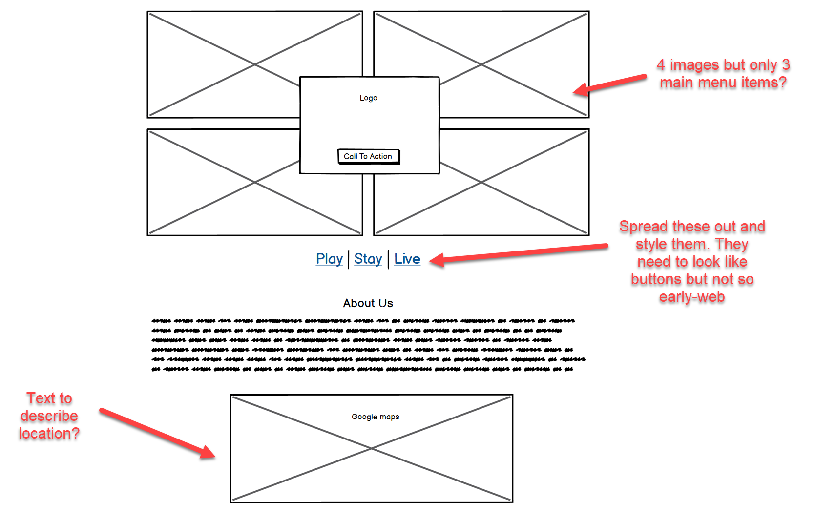
The client was anxious to see some high-fidelity stuff. I've found that it's hard for clients to envision digital products when they're just some chicken scratch drawings with X's and scribbles. I fired up Figma and went to work.
When presenting designs to clients, I always offer users several options to choose from so that they can have a say in the artistic direction of their product. I do this by mocking up 4-5 high-fidelity screenshots (usually something like a landing page) before I continue prototyping the whole website. I've found that landing pages propel the UI of the whole website. They set the tone for the theme, colors, fonts, element placement, and flow of the entire project.

After narrowing it down, I fully fleshed out the home pages. The final design ended up being a variation of Design7 shown above. I conducted some A/B testing with the client to determine favorite styles and features. The text on the menu was hard to read since the thin font blended in with the super-colorful background photo. Even with a dark gray mask it wasn't perfect. The colored logo also blended into the slideshow photographs a bit too much. In the end we opted to alternate between black/white images and colored ones. The logo was unsaturated to a pure white and rested on a green background so that it could be seen easier and stand out more from the images behind it.
Once the dust settled on the homepage, I mocked up the responsive versions of the site and proceeded to the build phase.

Design Decisions
- There wasn't a clear need for a prominent call to action button on this website. It's one of the first things that designers might notice is missing in the traditional sense. The website was built in the style of a "digital brochure", so most of the focus was placed on delivering information in a concise and meaningful way. There is plenty of room in the final design to spruce up the call to action (currently the "Contact Us" button).
- The triad photos as seen in the bottom of Design7 were a huge hit and we decided to propagate those to each page of the site with respective images showing the theme.
- In the end I decided on using more traditional link buttons instead of ghost style bordered buttons. In a flat design, ghost buttons don't really stand out as anything special or clickable. Established web users can quickly identify underlined text as a link. Per Steve Krug's principles of "Don't Make Me Think", reduced cognitive friction wins out over pretty styling any day.
- Each of the sections needed to allow for an indefinite amount of text that was yet to be created by our copywriter. The content sections needed to be flexible without breaking the core visual ideas.
- Links at the bottom needed to be easily actionable while still preventing as much spam as possible. A clever solution was to turn the email address into an image so that it couldn't be read by text crawlers. Direct email contact is still possible by the form, but it's much easier to control spam through that method than a straight mailto in an anchor tag.
Build
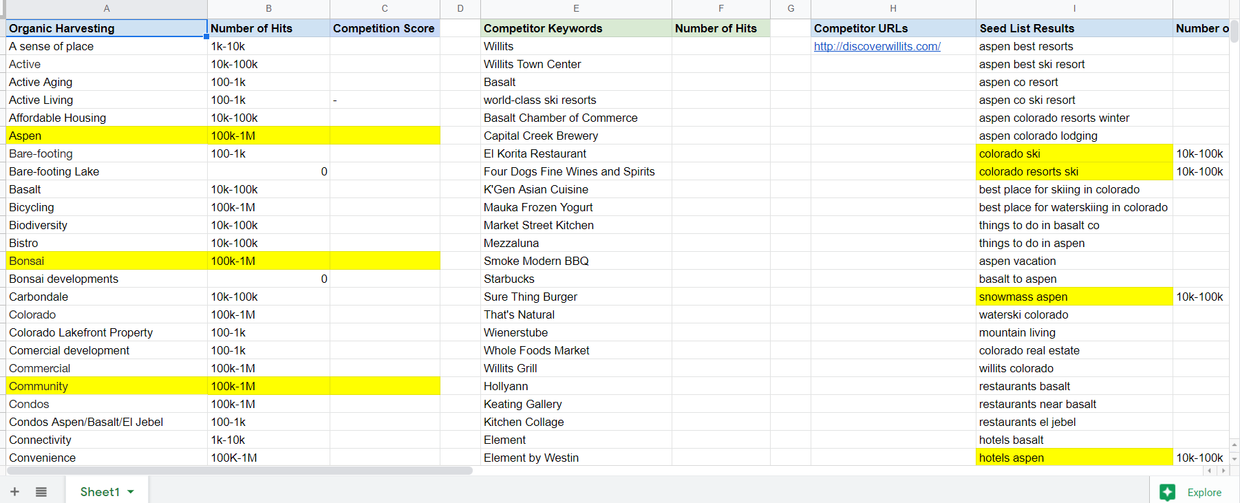
While I was coding, I had the team help me with SEO research. We went through several rounds of keywords. Several of the client's team members chipped in with their own ideas and brainstorming sessions with their friends, family, and other potential users.
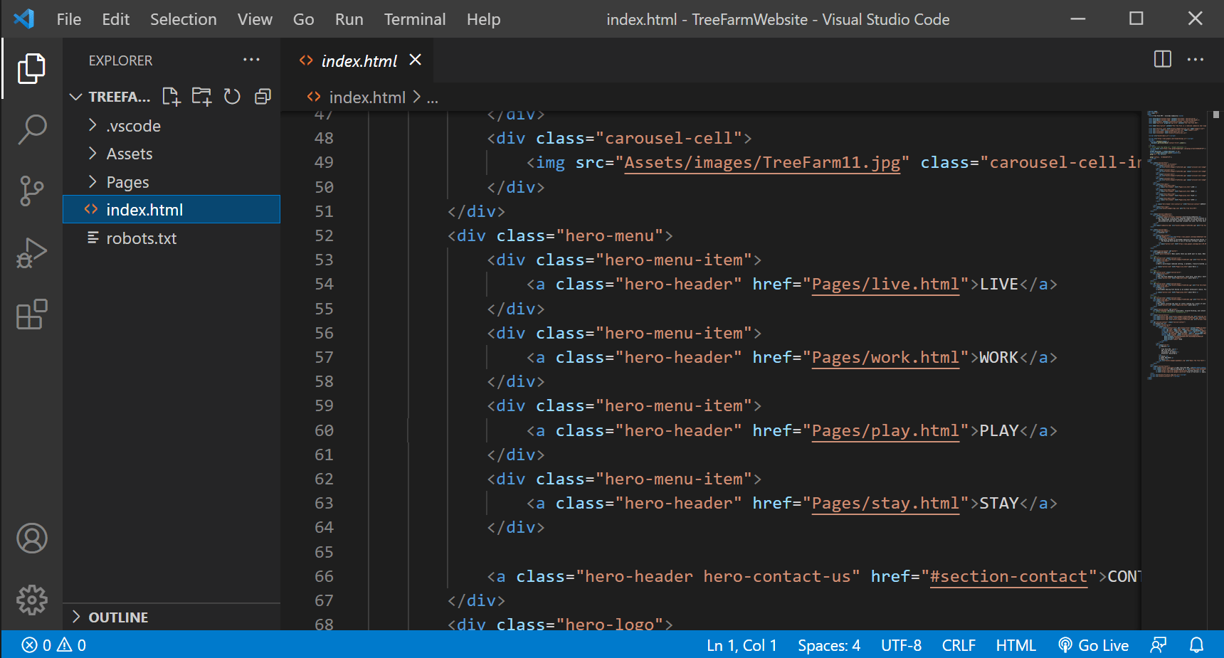
Building this website was fairly straightforward. As the elements were mostly blocks, the challenges were minimal. I used a the conventional tried-and-true trio HTML/CSS/Javascript to develop the website. A couple plugins came in handy, especially the one for the carousel slideshow. Normally I try to avoid these as stability and longevity are concerns. But after reviewing the javascript I was pretty confident this slideshow plugin would be solid for years to come.
Developing the website was an iterative process, and I showed off product whenever I could to the client to gather feedback and adjust on the fly. Photos, text, colors, and entire code blocks were swapped at various points during the development. As usual I tested as I built. There were a couple responsive breakpoints that gave me some trouble, mostly with regards to image sizing cutting off text and other small things. None of it was too overwhelming and the fixes were minor. It's one of the smoothest websites I've worked on and that's one of the reasons I'm proud to put feature it as a portfolio piece.
Outcome

As the data started pouring in from Google Analytics and Google Search Console, we noticed the rewards from our efforts. The new optimized website was resulting on the front page for dozens of search queries, and sometimes even in the top spot, beating out the competition in the area and the other businesses that have resided on the property in years past.
Data shows hundreds of users and thousands of page views. About 50% of viewership accessed multiple pages beyond the home page. This was a big step up from previous results. More than anything the client has a website they are proud to showcase in their presentations, articles, and marketing campaigns. The biggest wins are yet to come as the Tree Farm ramps up its construction phases and tenant's "Open" signs start appearing in the windows.
What I Learned
This project has taught me the value of working with family. It gave me another opportunity to bond and deepen my relationship with my father. I'm extremely grateful that I was able to aid in his project, and humbled by the praise and positive reviews he's shared regarding the website.
In my freelancing career which has been rather short, this is the first time I knowingly and deliberately followed the Design Thinking process from start to finish. While I was following the steps accidentally in some of my other projects you read about in my portfolio, this one taught me to trust the process and create traceable documentation every step of the way.

