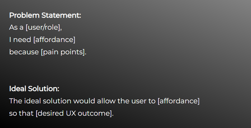
Problem Statement
Drafted from user requests after UX hypothesized the root cause.
Ideal Solution
Served as a boundary for ideation, narrowing our focus to achieve a desired MVP outcome.
*Disclaimer: Due to government security and NDA, I am not able to disclose details about the domain of this project.


CTA is contracted with the US Navy to provide a suite of financial and project management applications. Our job was to help several naval departments gather, store, and analyze data so that they can efficiently produce some of our military's most innovative technologies. Hundreds of users interact with the application suite every day, each contributing their specialty to a multi-layered and complex PPBE process. Dozens of data types stream into the department from multiple external sources and are ultimately stored in our application as a record-of-truth, taking the users out of the depths of uncontrolled and often inaccurate Excel documents into a modern age of data entry and analysis with a kaleidascope of data visualizations to support decision making.
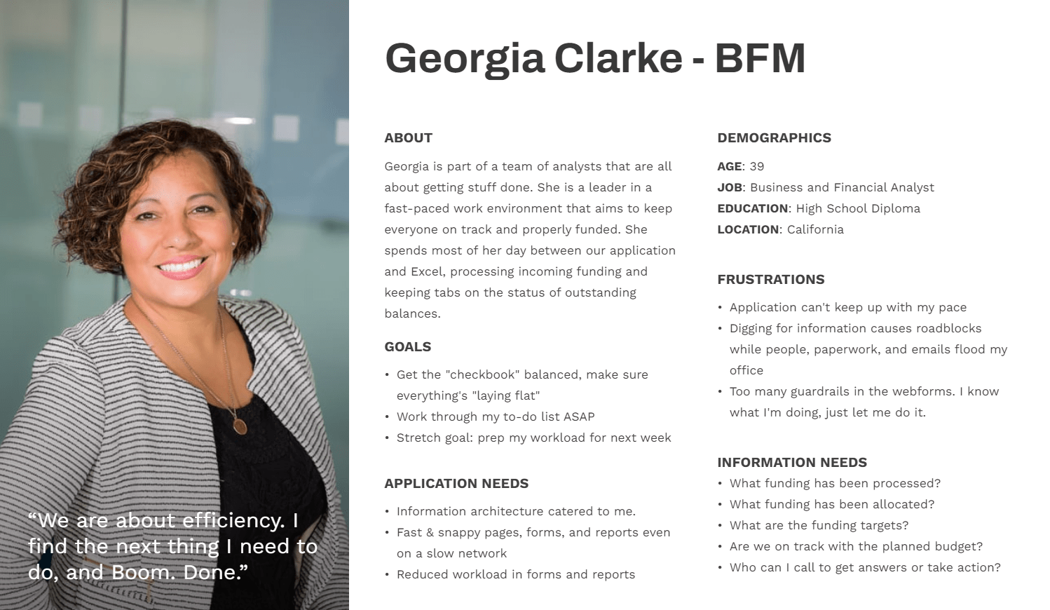
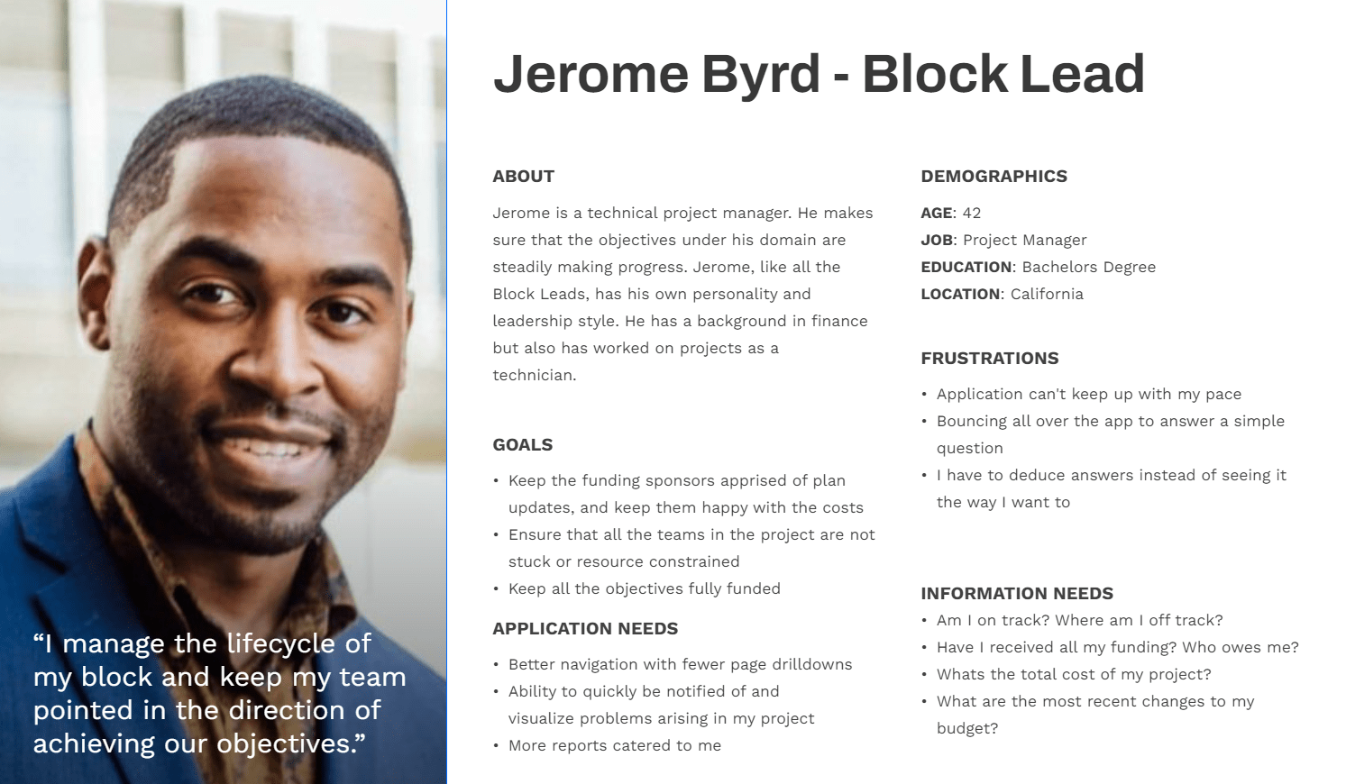
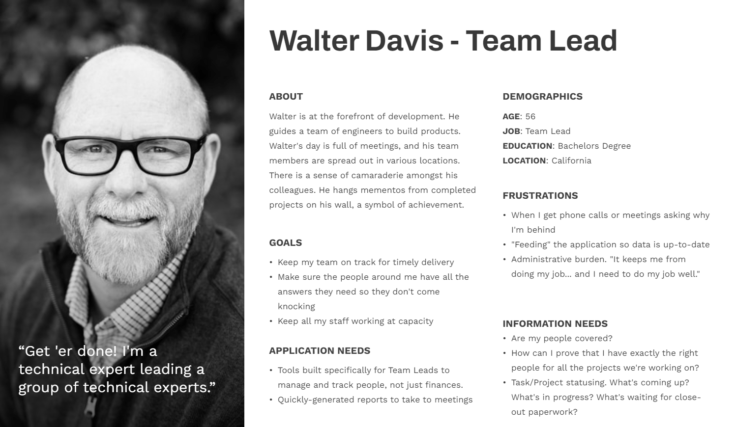
The application supported hundreds of users with a diverse set of roles and responsibilities across the organization. Through all the individualized feedback we received, there were definite trends in pain points and data needs that were consistent amongst the users in certain job-roles.
Users provide feedback and/or we observe pain points
Product Manager drafts requirements
I ideate and present possible solutions to devs and Product Manager
I created high fidelity prototypes and wrote a technical plan for the solution
I presented the design specs to the development team
As our company transitioned from a waterfall approach to agile, we adopted a quarterly release cadence. In between releases users would fly from California to Colorado Springs for several days of intensive research and planning. These summits offered a rare time to engage with customers in-person, so we packed the schedule full of research and prioritization activities. It was a chance to usability test features we just built and interview, journey map, analyze use cases, and iron out requirements for new requests.
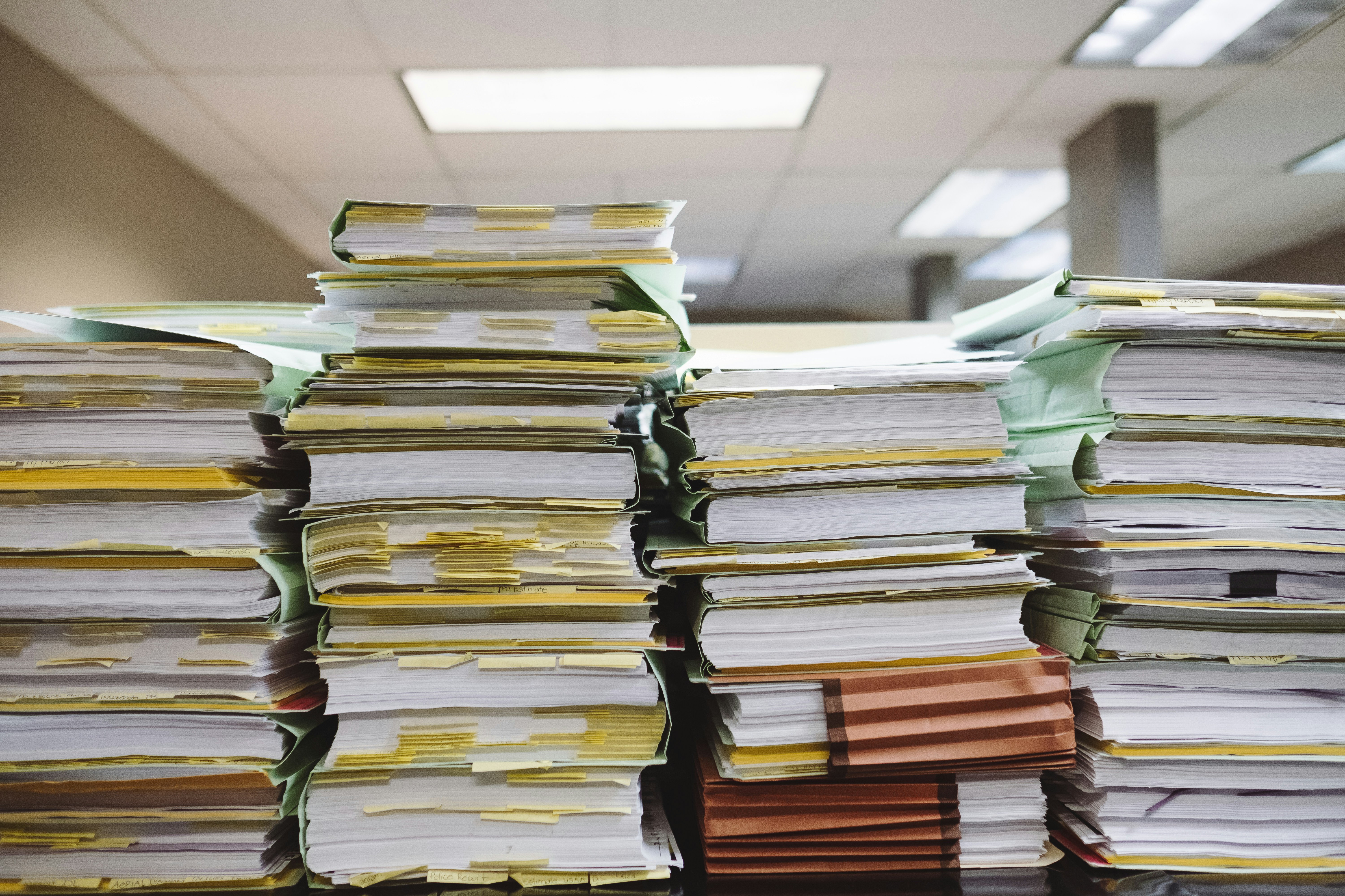
Collected over the course of a decade, our team documented thousands of application requirements. These specifications communicated everything from use cases to form validation rules.
The requirements provided an reliable way for our internal test team to verify the application was working according to user & business needs. They also created a benchmark for consistency.
Additionally, they provided a valuable reference guide for features built years ago. Oftentimes we'd ask ourselves why we built things a certain way, and the requirements were an easy way to get answers.
While this level of detail goes against the Agile Manifesto's "working software over comprehensive documentation", we would have had a difficult time keeping tabs on all the nuance without this lifeline.
Drafted from user requests after UX hypothesized the root cause.
Served as a boundary for ideation, narrowing our focus to achieve a desired MVP outcome.
A communication document for UX to propose top-contender ideas to our Product Manager and developers.
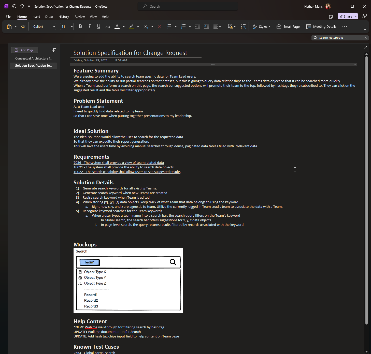
A step-by-step guide for the developers to build the design, including a compilation of requirements and all relevant details to the user story. This document was the final output I'd provide for a feature.
We recorded some data in production databases to monitor certain quantitative analytics like logins and CRUD operations.
We used this information to help prioritize features, determine usage of released features and diagnose production bugs.
However, due to security protocols we could not have any more traditional tools like heat-mapping and click tracking built into our application.
Tactics like usability testing and recorded observation were not an option.


